

The Kingston Symphony is 67 years old and instead of retiring we are doing just the opposite. We recognized that it was time for a new brand identity that captures our organization’s vitality and reflects our ongoing mission to deliver excellent, professional quality, and innovative performances.
Over the past few months, the Kingston Symphony has undergone a makeover. Last November, we sent out a series of surveys to our audience members, donors, and musicians and we received an overwhelming response. Thank you to everyone who took the time to participate; we read every response, we listened, and we took your feedback to heart.
While we had hoped to launch our new look in a bigger, more public celebration, we simply could not wait and wanted to share with you what we have been working on. We are proud to announce the launch of our new brand identity as part of the ongoing growth and evolution of the Kingston Symphony Association. It includes a new logomark, logotype, and colour palette, which reflects
who we are today and symbolizes our dynamic future as Kingston’s symphony orchestra.
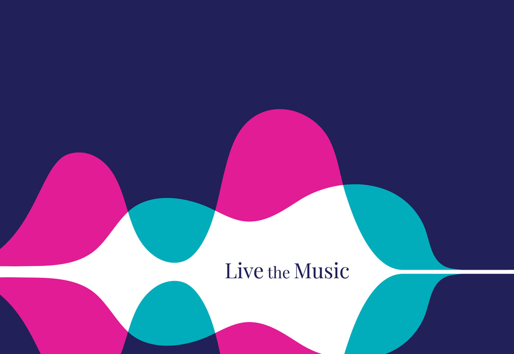
The Kingston Symphony logomark is based on the visual representation of soundwaves. The soundwaves and colours blend together, symbolic of instruments and voices creating music. The waves also reflect Kingston and the water that surrounds us. The curl at the beginning of the wave is intended to represent the scroll on string instruments. The hidden string instrument in the
soundwaves is intended to be “discovered” by the viewer, thereby making the brand identity easier to remember. The serif font chosen for the logotype is a nod to the history of the symphony as well as the classical repertoire that it performs, and contrasts well with the more modern logomark. The colours were chosen to imply the excitement and vibrancy of the live musical experience.
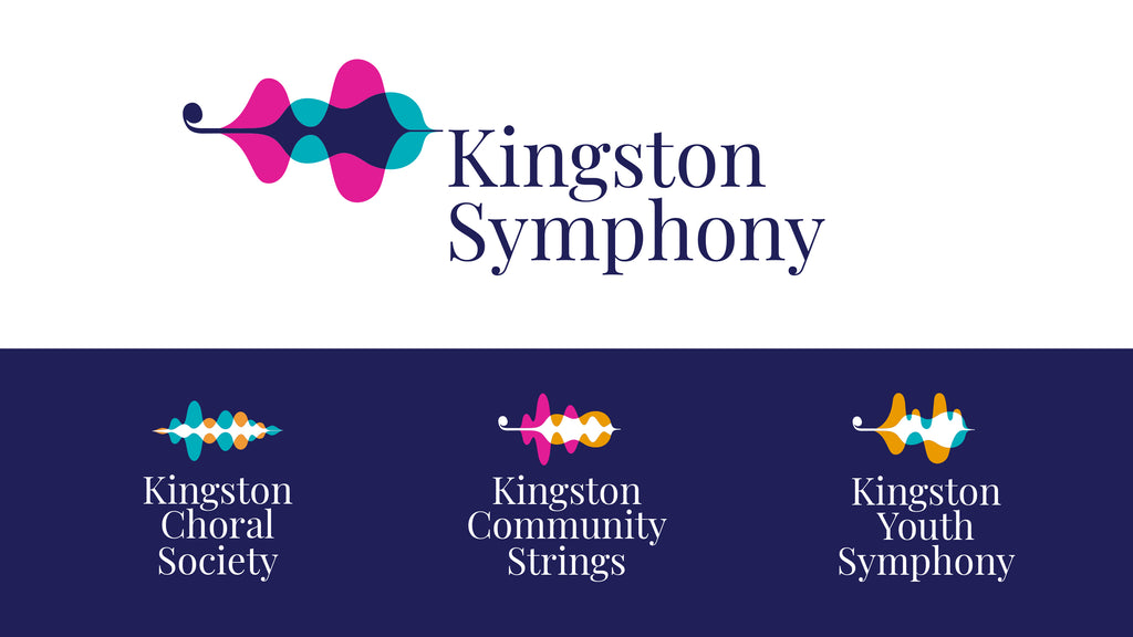
The purpose of the rebranding is also to unify the member groups that make up the Kingston Symphony Association: the Kingston Choral Society, Kingston Community Strings, Kingston Youth Orchestra, and Kingston Symphony Association Volunteer Committee.The family of brands have similar elements to tie them together as well as unique shapes to differentiate them. The Kingston
Choral Society logomark uses two vocal waves without the hidden instrument. The Kingston Community Strings logomark contains the instrument with a different soundwave and introduces the gold colour. The Kingston Youth Orchestra logomark also contains the instrument as well as a
more playful wave to represent the younger musicians. Lastly, the Kingston Symphony Volunteers logomark uses the main Kingston Symphony logo since they support the organization as a whole.
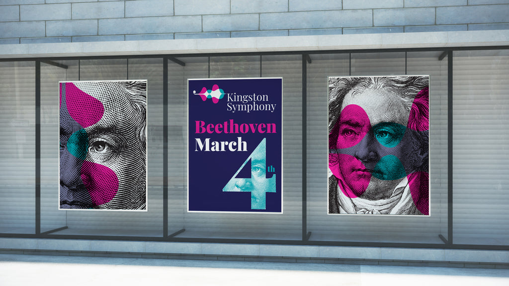
You will see our new look anywhere we are - out in public, on our website, social media, digital performances, merchandise, and hopefully soon, in the concert hall!
“Our new logo represents the fresh and vibrant outlook of our symphony. In recent years we’ve taken such great strides, and evolved to exist at the cutting edge. Whether it’s expanding our profile with world-class soloists, commissioning and premiering large-scale new Canadian works, or proudly standing at the forefront of digital initiatives, the Kingston Symphony’s brand is one of success and innovation, with an eye to the future.” -Evan Mitchell, Kingston Symphony Music Director
“I really like the Kingston Symphony’s fresh new look and of the overall brand identity. The new logo is a great improvement from the last one which was old fashioned and conventional. It makes me proud to be part of the orchestra, I’m looking forward to seeing what’s next!” -Olivier Brisson, Kingston Symphony Principal Horn
“As soon as I saw the new logos I was impressed. I love the simplicity of the stringed instrument curves of the Kingston Symphony logo and then was further impressed by the different logos of the affiliated groups, all of which evolved around that main logo. I think this was a great initiative and very well done!” -Stephen Yates, Kingston Choral Society President
“I really like the new logo, I think it is fresh and new. I like how it incorporates waves which could represent the different groups moving individually but also together. I also like the stylized string instrument.” -Jennifer Tindale, Kingston Community Strings Manager
“I think the new Kingston Symphony Association branding initiative has great musical symbolism and subtle Kingston symbolism wrapped up in a vibrant colourful logo. I like how it has logos for all of the groups within the Kingston Symphony Association and I think this will help the public see us as members of the same community organization while at the same time promoting the
Kingston Symphony as our flagship musical ensemble and raison d’etre.” -Hugh Johnston, Kingston Symphony Youth Orchestra.
“I love our new name “Kingston Symphony Volunteers.” I feel that the symbolism of the image is very appealing - the waves in the image relate to sound waves and to the waves of Lake Ontario. The use of the instrument provides the connection to the orchestra. I think the new look will be highly successful and look forward to the time when all the volunteers can see it.” -Beth Woodley, Kingston Symphony Association Volunteer Committee Chair